Teaching My AI Coach to Draw
What I learned designing generative UI for my fitness app's coach, before building it.
· 12 min read
Part 1 of 2 · Generative UI for an AI Coach
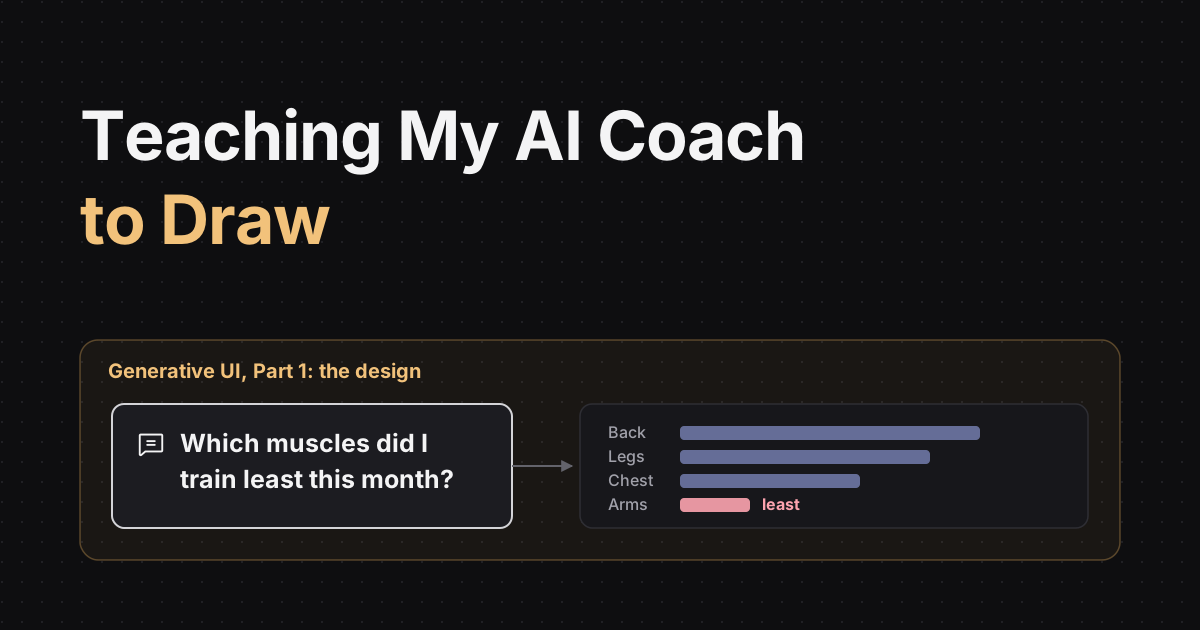
Forged is a fitness app I'm building, and it has an AI coach. You ask it things like "How's my squat going?" and it answers.
Until now it could answer in two ways: plain text, or one of a few cards I designed by hand, like a lift progress card or today's plan. When a question matched a card, the answer looked great. When it didn't, you got a paragraph.
And plenty of questions don't match a card. "Compare my bench and overhead press over 8 weeks." "Which muscles did I train least this month?" Those are questions about your own numbers, and a paragraph full of numbers is the hardest way to read them. People take in a chart much faster than a sentence with six numbers in it.
That's why I wanted generative UI: let the coach draw the answer when a drawing is clearer than words.
This post is the design side of that journey: what I tried, what didn't work, and what I learned before building it. Part 2 will cover the build and what happened with real athletes.
The First Test Didn't Work, and That Was Fine
Before designing anything, I ran a quick experiment. I let a free model write UI components directly, using an existing generative UI format.
- It copied the tool output word for word instead of choosing a layout.
- 3 of 8 blocks were cut off at the token limit.
- The format's instructions added 30% to every prompt.
That's what a test is for. Each failure turned into a rule for the real design:
- The model doesn't write free-form UI. It fills in a structured tool call that the server can check.
- Composing a layout gets its own token budget, so it can't run out halfway.
- If anything fails, the coach falls back to text.
The Model Isn't the Product. The Layers Around It Are.
Next, I looked at how others do it. ChatGPT launched its own generative UI this year. According to Thesys's breakdown of the web app (Thesys sells its own generative UI product, so read it with that in mind), the model doesn't write raw code. It writes a markup language, and a server compiles it, drops the invalid parts, and hands it to the app, which renders native components.
Thesys's open-source rebuild works the same way: a component catalog generates the system prompt, and a gateway checks the model's output against that catalog before anything renders.
That changed how I thought about the whole problem. The model is one layer. What makes generative UI safe is everything around it:
- What the model is taught: a tool schema and a prompt section that describe the available blocks.
- How it decides: it picks a tool. A designed card if one fits, a composed layout if not, and text for advice.
- What it may send: structured JSON, never code.
- Who checks it: a validator on the server drops anything that isn't allowed, and tells the model what it dropped so it can fix the layout once.
- What happens when it fails: every layout is also written out as prose, so there's always a text answer.
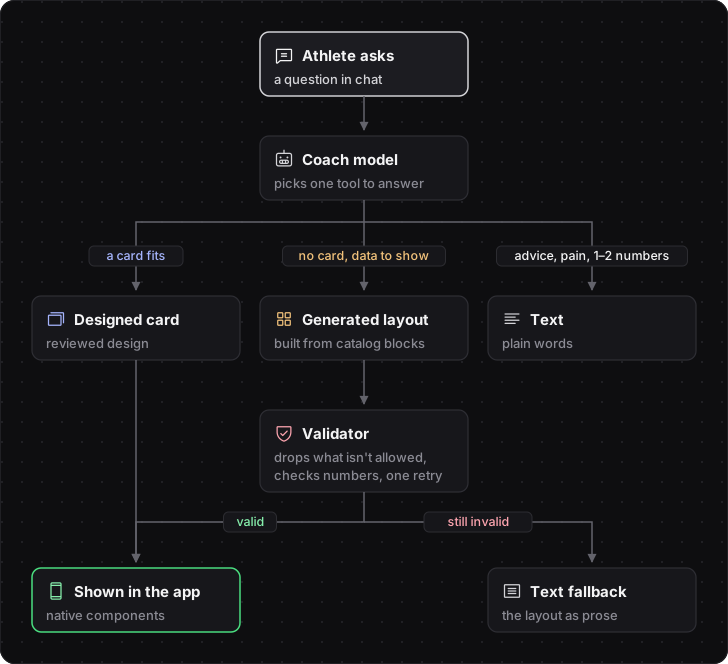 How one coach reply is chosen: a designed card, a generated layout, or text
One Catalog, Everything Generated From It
Early on, I spotted a trap. The prompt describes the blocks, the validator checks the blocks, and the app draws the blocks. That's three places that can disagree. If the prompt mentions a block the app can't draw, the model uses it, the validator drops it, and the athlete sees nothing.
So every block is defined once, in a single catalog in the Go API: its fields, its allowed values, and its limits. The tool schema, the prompt section, the validator, and the text fallback are all generated from that one source, and the app's renderer is checked against it. Adding a block means changing one file.
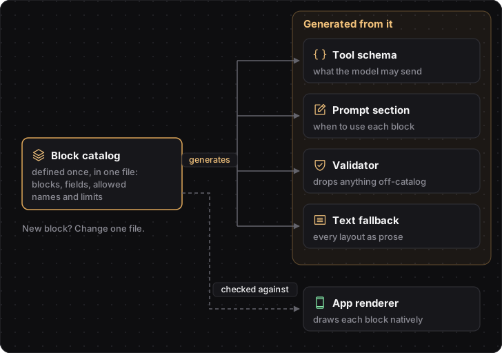 One catalog generates the schema, prompt, validator, and fallback
The Design System Lives in Code, Not in the Prompt
The model picks names, never values. No colors, no pixel sizes, no fonts, no images, no links, no HTML. It can only choose:
- a block from a fixed list: the blocks my designed cards already use, plus four new ones: text, list, table, and bar chart
- a text role: eyebrow, subhead, body, caption, or label
- a tone: better, worse, or neutral
- spacing: tight, normal, or loose
- a layout: a vertical stack, with rows of at most two blocks
The app maps each name to the real values in the design system. If the model asks for "red", the validator drops it. A prompt can ask nicely; code makes sure.
What surprised me most was how much the experience improved. Once the coach could only speak in the design system's vocabulary, its answers looked like they belonged in the app. They stopped being paragraphs to read and became something to look at. The whole coach got a lot more interesting to use.
Never Let the Model Invent Numbers
A chart with a made-up number is worse than no chart at all. I had two options:
| Check against tool results | Bind by reference | |
|---|---|---|
| How it works | The model writes 102.5; the server keeps it only if a tool returned it this turn | The model writes a path to the value; the server fills it in |
| Derived numbers (+10 kg, kg to lb) | Dropped, unless a tool returns them | Not possible, unless a tool returns them |
| Right number, wrong label | Possible | Not possible |
| Work for the model | Low | Higher: a path language a small model must get right |
| Work for me | A number matcher | A path language, a resolver, and its tests |
I chose checking for the first version. It's much simpler for a small model, and my test had already shown that models copy tool output faithfully. Every dropped block is logged with the reason. If the logs show numbers landing under the wrong labels, I'll switch to binding.
Old Patterns, New Presenter
When I started working out the solution, nothing about it felt brand new. The patterns I've used for years as a software engineer kept coming to mind: MVC, MVP, and MVVM. Each one gave me a piece of the design.
- MVC (Model, View, Controller): a controller takes the user's input, works with the model, and picks which view to show. That's the coach's first job: read the question, call the tools, and choose a designed card, a layout, or text.
- MVP (Model, View, Presenter): the view is passive. It has no logic and only talks to the presenter through a strict interface. That's my app renderer: it draws what it's given, and the block catalog is the interface.
- MVVM (Model, View, ViewModel): the view binds to data instead of holding copies of it. That's the "bind by reference" option for numbers: the model points at a value, and the server fills it in.
| Pattern | The idea I borrowed | Where it shows up |
|---|---|---|
| MVC | A controller handles input and picks the view | The coach picks a card, a layout, or text |
| MVP | A passive view behind a strict contract | The app only draws blocks from the catalog |
| MVVM | Bind to the data, don't copy it | The "bind by reference" option for numbers |
If you've built mobile apps, you might know the closest relative: server-driven UI. Companies like Airbnb send screens from the server as a list of components, and the app renders them natively. Generative UI is server-driven UI where a model picks the components instead of hand-written server code.
The one big difference is the presenter. In MVP, the presenter is code I wrote and tested, so I trust what it sends to the view. Here the presenter is a language model, and it can ask for blocks that don't exist, make up numbers, or stop halfway. So the contract between presenter and view has to be enforced at runtime, by the validator, instead of trusted.
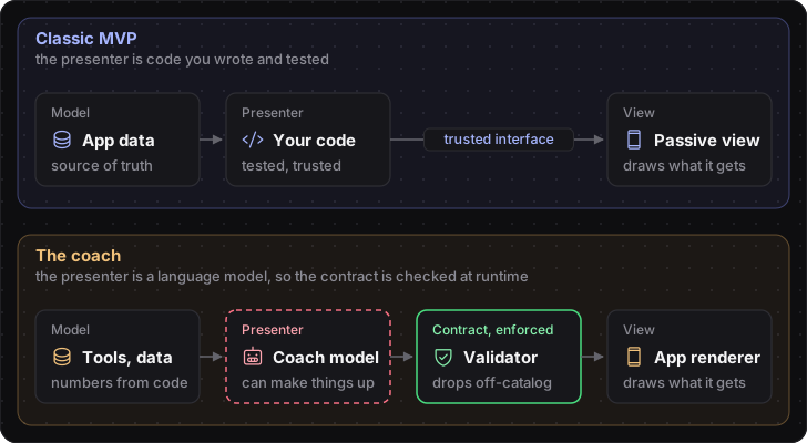 Classic MVP next to the coach: same roles, but the presenter is a language model, so a validator enforces the contract
That's when it clicked for me. AI-native development and traditional software engineering share the same core principles:
- Separation of concerns: the model decides, code computes, and the app draws.
- Contracts between layers: the block catalog is an interface, like any API.
- A single source of truth: one catalog for every block, and tools for every number.
- Never trust input at the boundary: the model's output gets validated like anything a user types into a form.
- Graceful degradation: if the layout fails, the athlete still gets a text answer.
- Observability: every dropped block is logged with the reason.
None of these are new. What's new is that one component in the system doesn't behave the same way twice. So I treat the model the way I'd treat user input or a third-party API: useful, but checked at the boundary.
When Should the Coach Draw at All?
More UI isn't better UI. A worried athlete doesn't want a dashboard.
| Athlete asks | Coach answers with | Why |
|---|---|---|
| "How do I brace for a squat?" | Text | Advice and technique: no data to show |
| "I tweaked my back, what should I do?" | Text | Pain and worry get words, never a dashboard |
| "What did I bench last time?" | Text | One or two numbers fit in a sentence |
| "How's my squat going?" | A designed card | A card already covers it |
| "Compare my bench and overhead press over 8 weeks" | A layout: two stats and a table | No card covers it |
| "Which muscles did I train least this month?" | A layout: a bar chart | Three or more items, each with a value |
| "Just tell me, no charts" | Text | The athlete asked for words |
Examples like these go into the prompt. A separate eval set uses different questions of the same kinds, so it tests whether the model applies the rules, not whether it remembers the examples. Each eval case runs against a test athlete with seeded data, because the right answer depends on the data: "How's my squat going?" with no squats logged should get text.
There are two ways to get it wrong, and I measure both:
- Too much UI: a rephrase or "just tell me" after a layout, or a layout nobody taps.
- Too little UI: a text reply carrying three or more of the athlete's numbers, or a follow-up asking to see them.
Generated Layouts Are a Discovery Tool
This is my favorite part of the design.
For common questions, a designed card beats a generated layout: the design is reviewed, the numbers are computed in code, and it can carry real actions. But I can't design a card for every question athletes might ask. So the two work together:
- Generated layouts answer the long tail as it arrives.
- Every layout is recorded, as structure only.
- A weekly report groups them by shape, with every value masked.
- A shape that keeps coming back across many athletes becomes a candidate.
A candidate then climbs the cheapest fix first: a prompt or catalog fix, then a tool that returns the missing number, then a pinned template, and only then a designed card. Cards are capped, so adding one eventually means retiring another, and cards that rarely show up or keep breaking get reviewed for retirement.
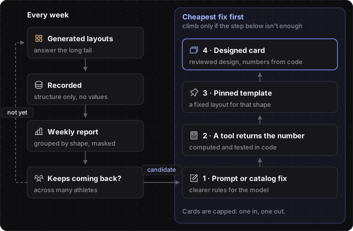 Generated layouts feed a loop that turns common ones into designed cards
How I Worked on This
I didn't write this design alone. An AI agent drafted the proposal, and I made the calls at each decision point.
For the rule that decides when a layout earns a card, three agents argued it over two rounds, playing a technical lead, a product owner, and customer success. They agreed on most of it and split on four points. One was whether high-stakes questions, like pain or personal records, should lower the bar for building a card. I said no: high stakes bring a case to my attention, but they don't build a card on their own.
Every decision ended up written down in the proposal, along with when it was agreed. That made it easy to open the tickets with nothing left vague.
Guardrails From Day One
The coach handles athletes' private chats and spends money on every model call, so a few rules hold from the first ticket:
- Privacy: the log keeps structure only, like block types and counts, and the review gallery masks every value.
- Rollout: a per-account switch, starting with my own account.
- Cost: composing has a fixed token budget, and eval runs on the paid model need my OK.
- Human gates: I approve the new blocks' design, every promoted card, and every merge.
What I've Learned So Far
- The model is one layer. The product is the layers around it.
- Define the catalog once, and generate everything else from it.
- Enforce the design system in code, not in the prompt.
- Don't let the model invent numbers.
- Measure both too much UI and too little.
- Use generated UI to discover what to design next.
- AI-native doesn't mean new principles. The ones we already know still hold; the model is just a component you can't fully trust.
What's Next
The build is planned as seven tickets in three waves, starting with the design of the four new blocks, since everything else depends on them. Part 2 will cover how it went, and what the coach actually drew once real athletes started asking questions.